


Websites are accessed on a wide range of devices, from smartphones to large monitors. Without responsive design, content may appear distorted, navigation elements may become inaccessible, or loading times may increase. A responsive website ensures a seamless user experience regardless of the device.
But how can you determine whether a website is truly user-friendly? Online surveys help collect direct feedback from users, revealing display issues, the devices visitors use, and areas for improvement.
In this blog post, you will learn what responsive web design means, the principles behind it, and the challenges it presents. You’ll also get practical tips on how to create a flexible and user-friendly responsive design.
Table of Contents
- Key Takeaways: Responsive Design
- What Is Responsive Design?
- The Principles of Responsive Design
- How Does Responsive Design Work in Practice?
- Challenges and Solutions in Responsive Design
- How Online Surveys Can Help Improve Responsive Design
- Conclusion: Why Responsive Design Is a Must
- FAQ – Frequently Asked Questions About Responsive Design
| Aspect | Details |
|---|---|
| Definition | Responsive design ensures that a website automatically adjusts to different screen sizes and device types. |
| Principles | Key elements include flexible layouts, responsive design images, and CSS media queries. |
| Implementation | Techniques such as CSS Grid, Flexbox, and lazy loading help create an efficient responsive design web. |
| Challenges | Common issues include long loading times, complex implementation, and lack of accessibility. |
| Online surveys | UX surveys provide valuable feedback on how users interact with your site across different devices, helping improve the responsive UX design. |
| Benefits | A well-structured responsive design layout improves usability, boosts SEO rankings, and increases conversion rates. |
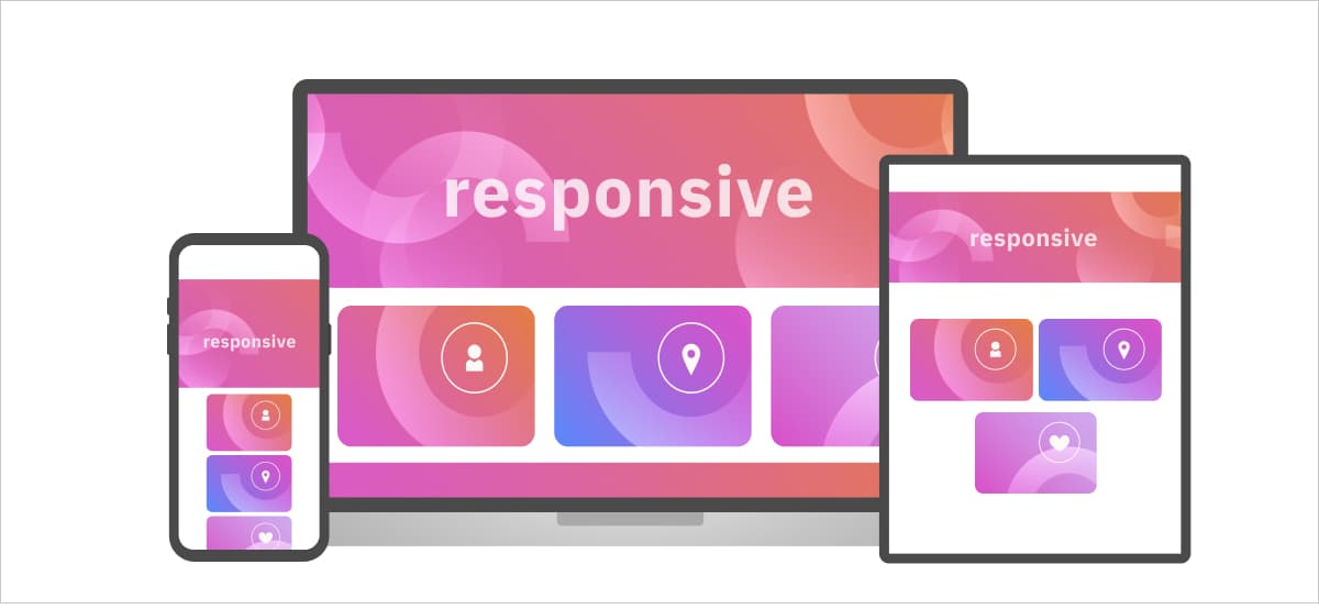
Responsive design means that a website automatically adjusts its layout to different screen sizes and device types. Text, images, and navigation elements are displayed in an optimized way on every device — without requiring zooming or horizontal scrolling.
Not every flexible website is based on responsive web design. There are similar concepts with different approaches:
| Design Approach | How It Works | Advantages | Disadvantages |
|---|---|---|---|
| Responsive Design | Content adjusts fluidly using CSS media queries for different screen sizes. | Single codebase for all devices, flexible layout | Requires careful design to look good on all screens |
| Adaptive Design | Predefined layouts for specific screen sizes are delivered based on the device. | Optimized for specific screen sizes | Less flexible, may not work well on all devices |
| Fluid Design | Content scales proportionally with the screen width. | Highly flexible, uses relative units | Can cause display issues on extreme screen sizes |
To ensure a responsive website works on all devices, it follows three key principles:
These principles ensure that a responsive design UX delivers an optimal experience regardless of the device.
A well-executed responsive design follows clear principles that ensure a website functions optimally on any device. These principles help adjust layouts, images, and content flexibly to provide a great responsive design UX.
Optimize Your Responsive Design with User Feedback
How do visitors experience your website on different devices? With UX surveys from clickworker, you gain valuable insights into optimization potential and how to improve your display settings.
More About the clickworker Survey Tool
Instead of using fixed pixel values, a responsive design layout is based on relative units like percentages or viewport sizes (vw, vh). This allows websites to adapt flexibly to different screen sizes.
Images and videos must also adjust dynamically to optimize loading times and prevent distortion. Techniques for responsive design images include:
max-width: 100%; ensures images do not overflow their container.srcset to provide different image sizes for different devices.With responsive design media queries, developers can define CSS adjustments for different screen sizes. Example:
@media (max-width: 768px) {
  body {
    font-size: 16px;
  }
}
This allows optimization of layouts, font sizes, or spacing for smaller screens.
Media queries are a fundamental part of responsive design, allowing web pages to adapt dynamically to different screen sizes. But how do they actually work in CSS? The following video by VirtualAddiction provides a clear explanation of media queries, their syntax, and how they modify page layouts based on screen width. Watch it to see media queries in action:
Many modern websites follow the mobile-first approach. This means designing for mobile devices first and then expanding for larger screens. This often leads to better performance and usability.
These principles form the foundation of a strong responsive design web. But how do you implement them effectively?
Theoretical knowledge of responsive design is not enough — it’s all about proper implementation. Both CSS techniques and optimizing media and navigation play a crucial role.
Modern CSS techniques make it easier to build responsive websites efficiently. Here are some key methods:
vw (viewport width) and vh (viewport height) enables dynamic scaling.clamp():
h1 {
  font-size: clamp(1.5rem, 5vw, 3rem);
}
Images play a central role in a responsive design web. Here are some best practices:
srcset to provide different image sizes for different devices.Intuitive navigation is essential for a good responsive design UX. Adjustments for mobile devices include:
Creating a responsive design layout requires careful planning. But even with the best technology, one question remains: How do you know if your design actually works?
While responsive design offers many benefits, it also presents challenges. Poor implementation can lead to long loading times, unreadable text, or broken layouts. Here are common issues and how to solve them.
A responsive website must load quickly on mobile devices as well as on desktops. Large images, unnecessary scripts, or poorly optimized code can negatively impact loading speed.
Solutions:
srcset to serve different image sizes for different screen resolutions.A responsive design layout must be tested across various devices and continuously optimized. Without a clear strategy, development can become time-consuming and error-prone.
Solutions:
A good responsive design UX must also consider users with disabilities. If content is not optimized for screen readers or font sizes are too small, it can exclude users. Besides technical adjustments such as color contrast and keyboard navigation, inclusive design helps make websites accessible from the start by considering diverse user needs in the design process.
Solutions:
<nav>, <header>, and <main> help screen readers structure content.These challenges show that a good responsive design web requires not only technical optimization but also a user-focused approach. One way to measure quality is by collecting user feedback.
Even the best technical implementation of a responsive design web does not automatically guarantee an optimal user experience. To determine if a responsive website truly works, direct feedback from users is essential. This is where online surveys come in.
A well-designed UX survey provides valuable insights:
Integrating online surveys into the development process enables data-driven decisions. Instead of relying on assumptions, companies receive direct feedback from real users.
Optimize Your Responsive Design with clickworker
With the clickworker survey tool, you can conduct targeted UX surveys and find out how users experience your website on different devices. Gain valuable data on display issues, usability, and loading times to refine your responsive design layout.
Learn More About the clickworker Survey Tool
By combining technical optimization with user feedback, you can develop a truly effective responsive web design that is both functional and user-friendly.
A well-thought-out responsive design is essential today to provide an optimal user experience across all devices. A responsive website not only enhances usability but also positively impacts SEO, loading times, and conversion rates.
For a responsive design web to be truly effective, consider the following key factors:
One of the most important steps is directly involving users in the optimization process. Online surveys help identify weak points and make targeted improvements.
By combining technical expertise, thoughtful design, and user feedback, you can create a responsive design UX that ensures excellent usability and keeps visitors engaged.
Responsive design is an approach to web development that makes websites automatically adapt their layout to different screen sizes and device types — from smartphones to large desktop monitors. It matters because the majority of web traffic today comes from mobile devices. A site that doesn't display correctly on mobile will frustrate users, increase bounce rates, and rank lower in search engines.
Responsive design uses fluid layouts and CSS media queries to adjust content continuously as the screen size changes. Adaptive design, by contrast, uses a set of predefined fixed layouts for specific screen sizes, switching between them based on the device. Responsive design is generally more flexible and easier to maintain with a single codebase, while adaptive design can be more precisely optimized for specific device categories.
CSS media queries are rules that tell a browser to apply specific styles when certain conditions are met — most commonly a specific screen width. For example, you can define that below 768px the font size changes or a column layout switches to a single-column view. They are the core technical mechanism that makes responsive design work.
Mobile-first means designing and coding for the smallest screen size first, then progressively enhancing the layout for larger screens. This approach is recommended because it forces prioritization of core content and functionality, often results in better performance on mobile devices, and aligns with how Google indexes sites (mobile-first indexing).
Online surveys give you direct feedback from real users about how they experience your site on different devices. They can reveal display issues, navigation problems, or slow loading times that automated testing misses. The clickworker survey tool lets you target specific user groups and collect this data efficiently — making it a practical complement to technical performance monitoring.
Google uses mobile-first indexing, meaning it primarily uses the mobile version of a website for ranking. A responsive site that delivers a good experience on all devices — fast loading, readable text, accessible navigation — will generally perform better in search rankings than a site that is only optimized for desktop. Core Web Vitals such as Largest Contentful Paint (LCP) and Cumulative Layout Shift (CLS) are directly influenced by how well responsive design is implemented.


